UI Design
Epiderma IQ — Smart Skin Checker with AI
Role
UI Designer
Tools
Figma, Illustrator
Scope
Partial UI + Visual Design for a health-tech app
Epiderma IQ is a prospective mobile feature/app designed to help users identify and manage skin symptoms using a sleek, AI-powered interface. The focus of this project was to deliver a visually polished, emotionally supportive experience that blends symptom checking, photo analysis, and wellness tools. The UI is built for scalability, inviting expansion into a full health assistant platform.
Problem
Skin issues—rashes, irritation, acne—can be distressing, but many users hesitate to seek help. Whether due to embarrassment, long wait times for specialists, or difficulty describing symptoms, people often turn to vague internet searches or delay treatment entirely. This leads to increased anxiety and in some cases, worsened conditions.
While there are AI health tools available, most are either too medically sterile or lack intuitive UX. There's a noticeable gap in solutions that balance diagnostic power with a friendly, approachable interface—especially for sensitive, highly visual issues like skin health.
Epiderma IQ aims to fill this gap by blending a calm visual experience with clear, interactive symptom input and AI-powered insights.
The Challenge
Design a skin-focused checker that feels trustworthy, accessible, and helpful — not just for one skin tone, age, or gender — but for everyone.
The Goal
The main focus is to: Help users check minor skin concerns with confidence; reduce reliance on frantic Google searches, and deliver care suggestions that feel human, not robotic.

User Goals
- Describe skin symptoms easily and intuitively
- Upload photos for AI analysis
- See clear visual feedback on symptom areas
- Access a calm space (Zen Room) to reduce skin-related stress
Design Goals
- Make the user feel seen and supported from the first screen
- Build confidence in the AI through simple, elegant visual structure
- Maintain consistency across all touch points
Research & Insights
Before diving into wireframes, I took time to explore how users actually deal with skin concerns. I spoke with:
- —Friends and peers who manage eczema or acne
- —A student nurse who often answers basic skin questions informally
- —A skincare community on Reddit
Key Patterns Identified
- —People do not know when to worry and when to wait.
- —Google is overwhelming and often misleading.
- —Tools rarely show how symptoms appear on brown skin.
- —Most users just want reassurance, next steps, and a visual way to explain their concern.
Fictional Personas

Maya, 28, Student
Experiences hormonal acne and often relies on online forums. She values calm, reliable self-check tools.

Leo, 35, Software Engineer
Skeptical of medical apps, yet open to well-designed tools with intuitive interfaces and evidence-based recommendations.

Nora, 46, Biochemist
A busy professional looking to track skin flare-ups over time and reduce unnecessary appointments.
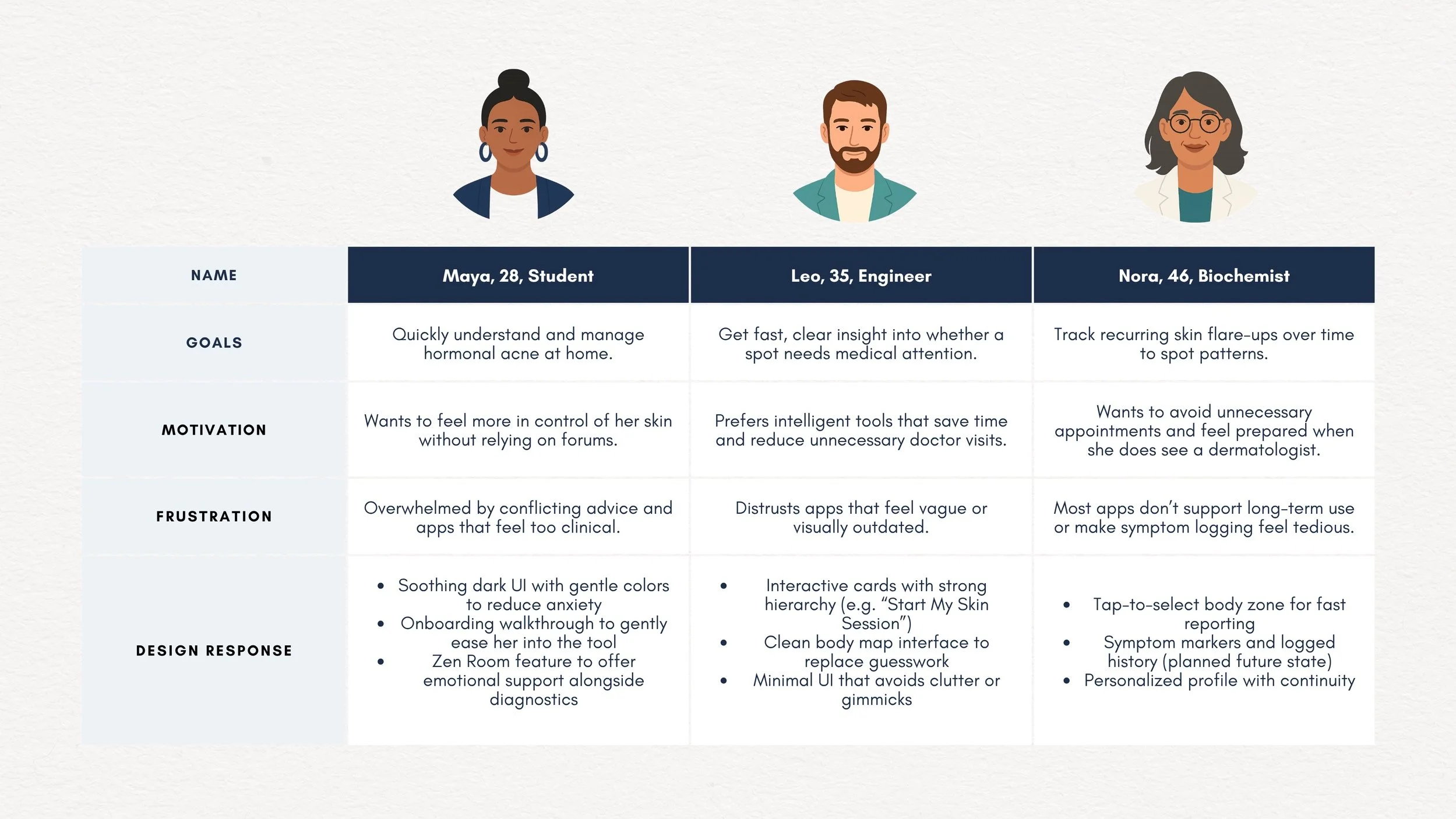
These personas reinforced that the Epiderma IQ UI needed to combine clinical confidence with visual calm — which directly informed the tone, layout, and structure of each screen.
Competitive Scan Highlights
AYSA (by VisualDx)
Strengths:
- Backed by physicians
- Trusted clinical database
- Easy image input
Gaps:
- Text-heavy
- Lacks modern UX polish
- Can feel clinical and impersonal
AI Dermatologist
Strengths:
- High diagnostic accuracy (97%)
- Recognizes 58+ skin conditions
Gaps:
- Focuses purely on detection
- Minimal emotional or design consideration
Skinive
Strengths:
- CE-marked medical software
- Used by professionals & at-home users
Gaps:
- Functional UI
- Lacks warmth or onboarding support
Epiderma IQ aims to combine diagnostic power with visual and emotional approachability—unlike current tools that skew clinical or overly generic.
User Scenarios & Task Flows
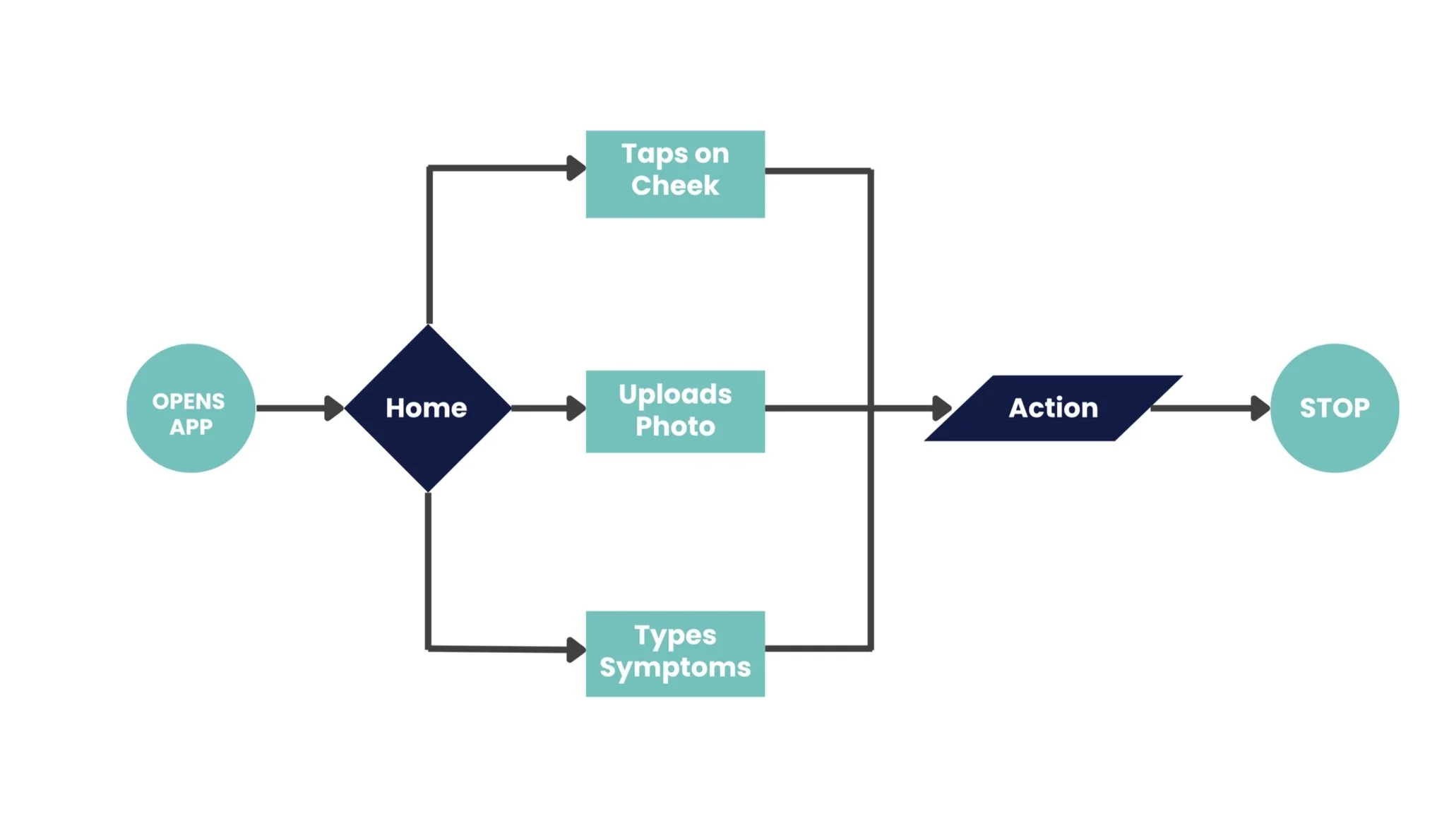
To validate feature navigation and interaction points, I mapped three quick task flows based on fictional personas:
Maya opens the app, taps on the cheek via body map, and expects quick AI feedback without typing.
Leo skips the body map, uploads a photo directly, and wants clear visual results.
Nora logs recurring symptoms weekly and needs a calm, consistent space to track and reflect.
These flows confirmed the need for a flexible, modular structure where users can begin their check from multiple entry points — visual (body map), photo-based, or tracking-focused.
Visual Design System
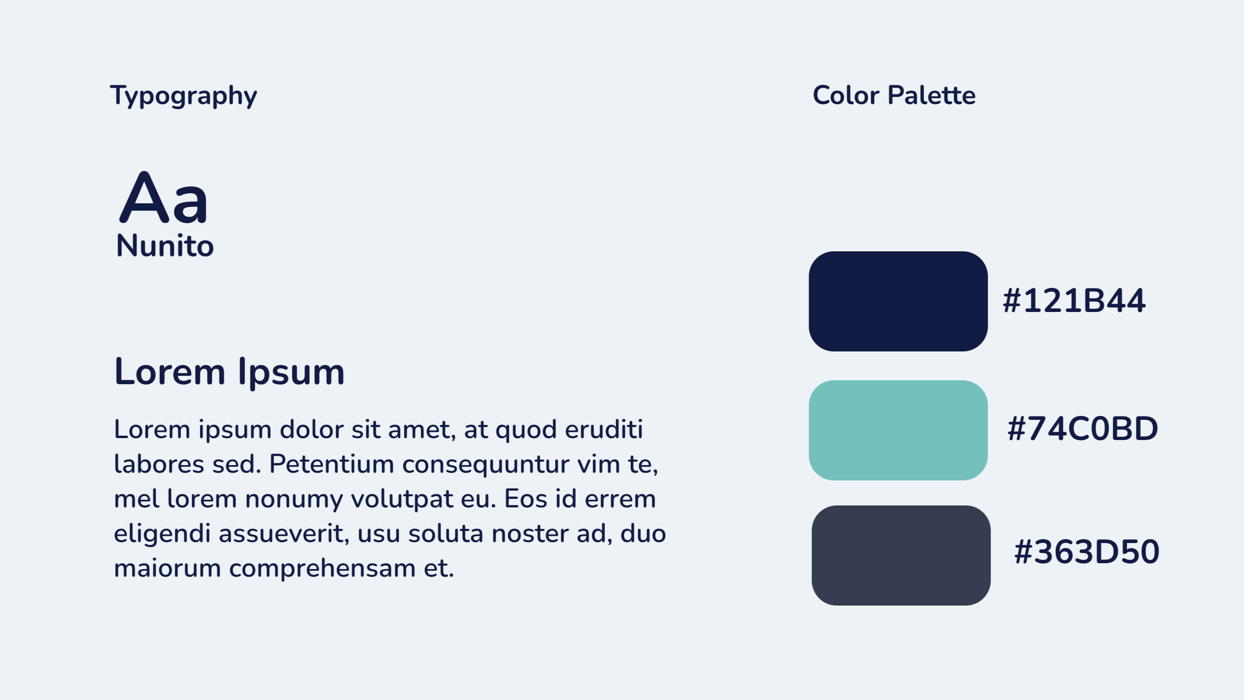
- —Colors: Midnight Blue, Teal, and Charcoal Gray — chosen for clarity, emotional calm, and night-time usability.
- —Typography: Nunito for UI friendliness, paired optionally with Inter for data-heavy moments.
- —Iconography & Illustrations: Rounded avatars and line icons with glowing effects to signal interactivity without visual overload.
- —Layout Mood: Spacious and quiet, with generous padding and no unnecessary distractions.
UI Design Process
The Epiderma IQ interface was designed with modularity and calm navigation at its core. Each screen was purpose-built to support different user goals — whether symptom discovery, photo-based AI analysis, or emotional decompression through wellness support. This section breaks down the design decisions behind each flow and key interface component.
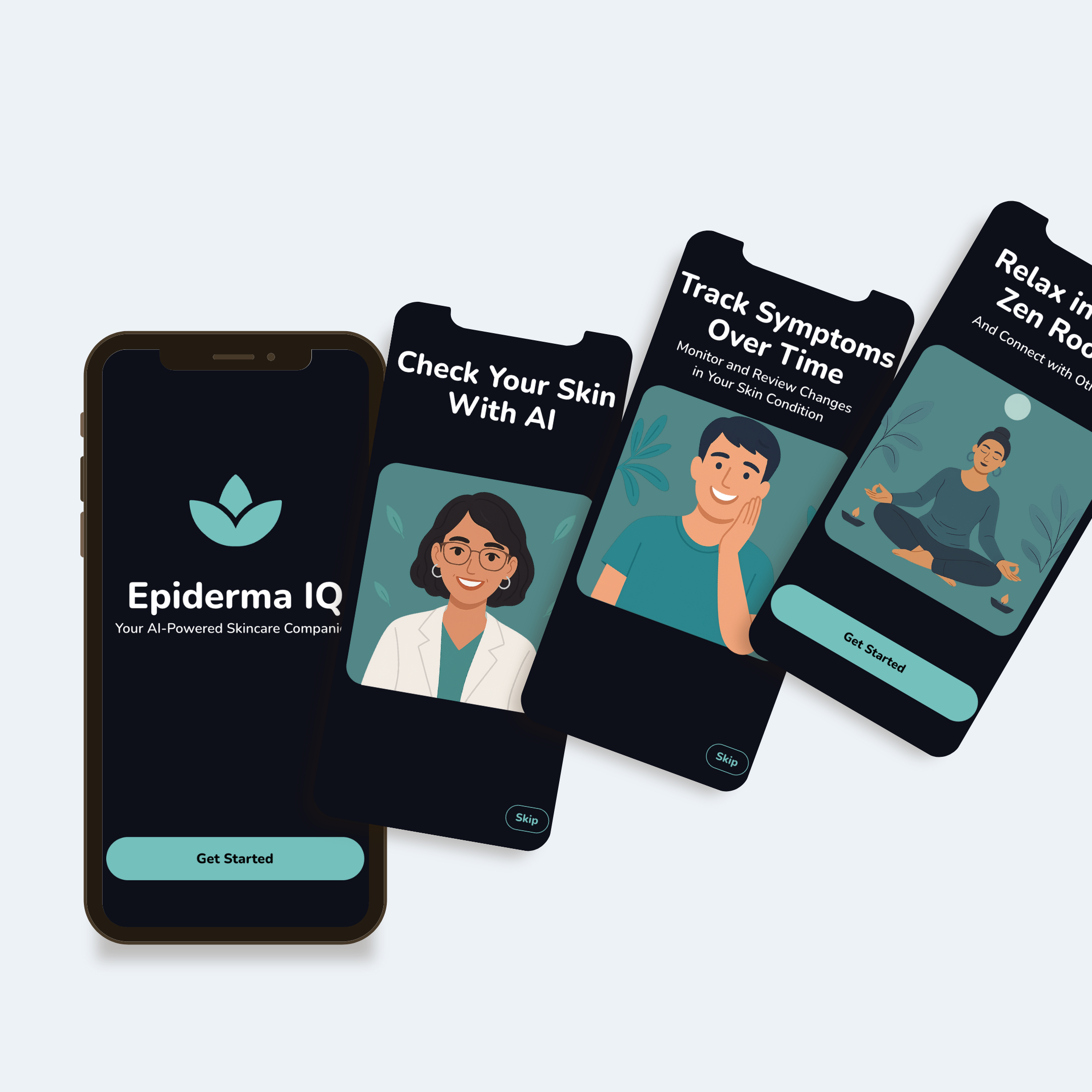
Welcome & Onboarding
Setting a Calm, Trustworthy Tone from the Start.
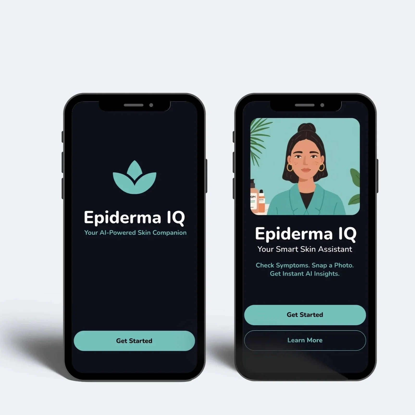
These screens establish a gentle, non-intimidating first impression. From the welcome logo to the onboarding messages, users are guided with warmth and clarity. Soft illustrations and direct calls-to-action help build trust and encourage users to explore their skin health journey.
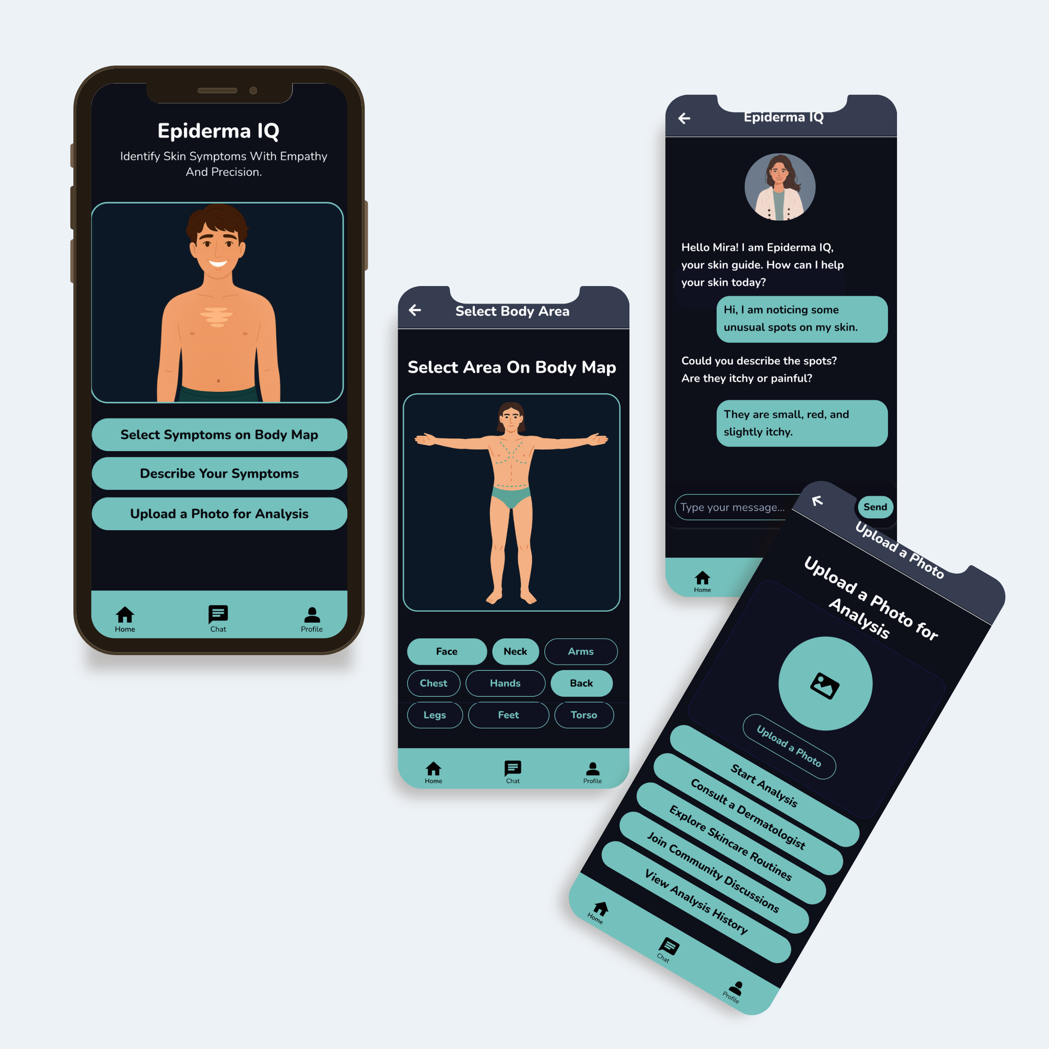
Symptom Input & AI Analysis
Multiple Ways to Share, One Goal: Fast Relief.
This flow supports different user preferences: tapping the body map, typing symptoms, or uploading a photo. The goal is speed and clarity—AI instantly processes the input and offers suggestions or next steps, helping users feel heard and informed without confusion.
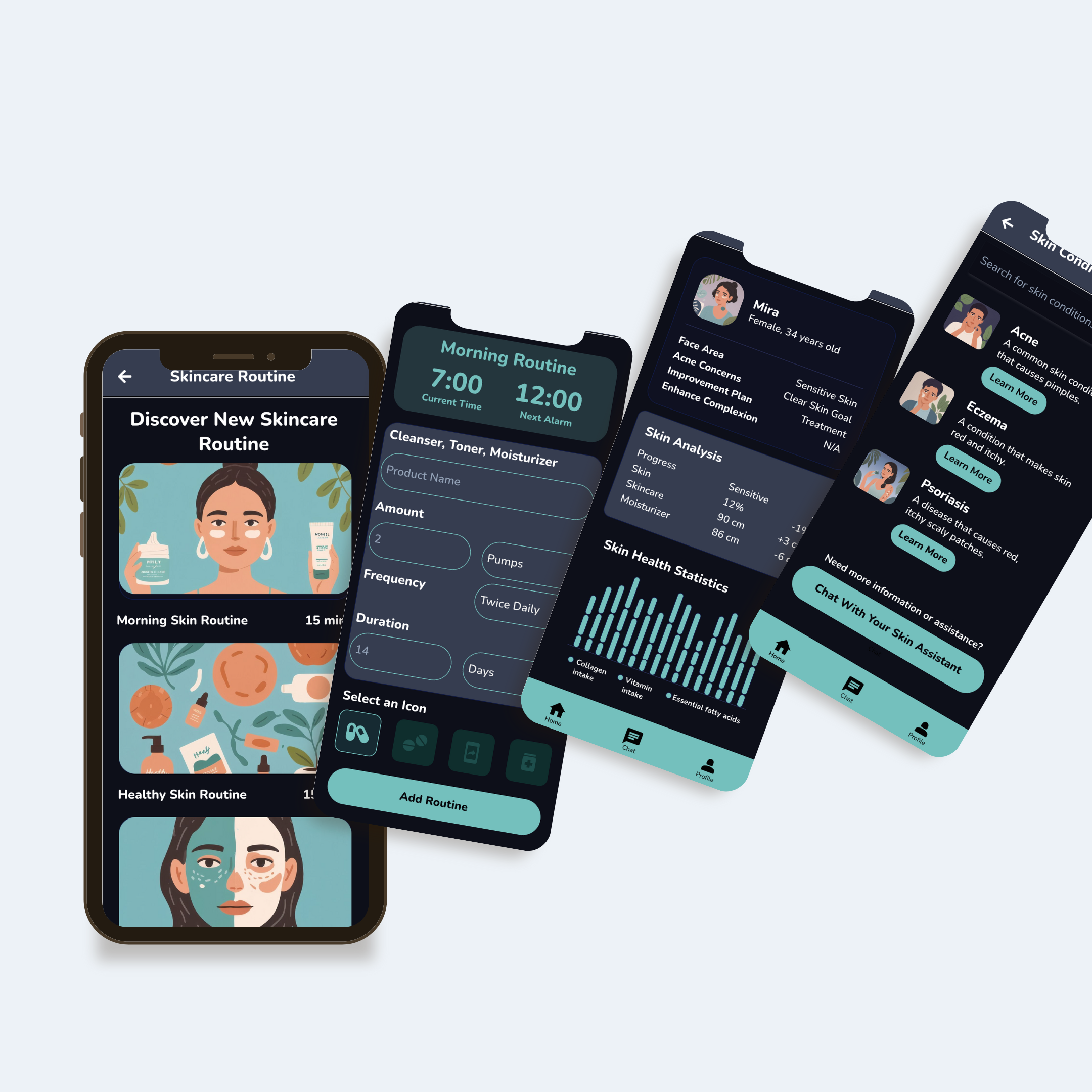
Personalized Skincare & Routine Building
Helping Users Build Habits, Not Just Get Diagnoses.
Beyond symptom tracking, Epiderma IQ supports long-term care. Users can create custom routines, track their product usage, and visualize progress. These tools promote consistency and self-care, encouraging users to develop sustainable skincare habits tailored to their needs.
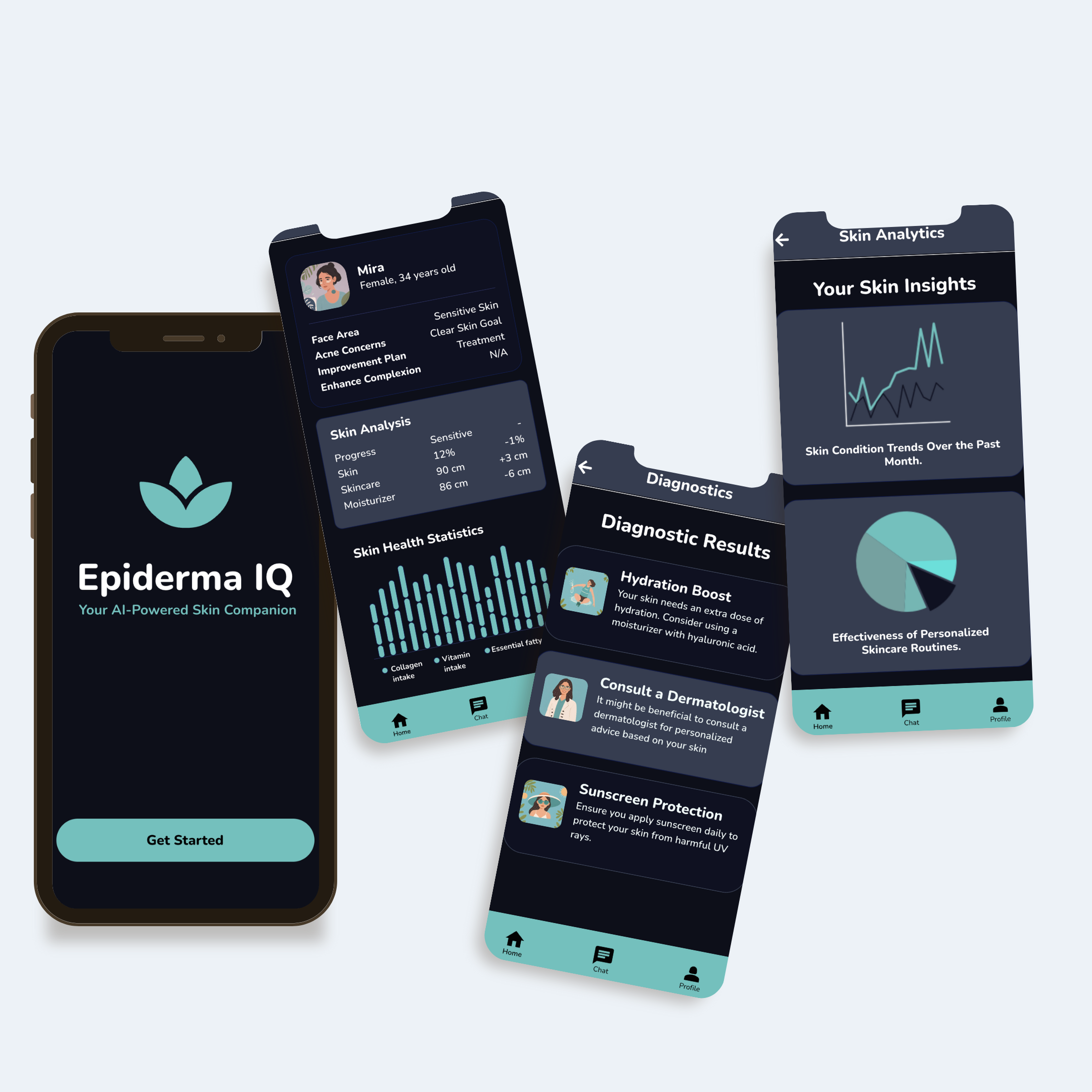
Insights & Progress Tracking
Motivating Users with Clear Progress Data.
These screens translate user data into meaningful insights. From hydration levels to skincare effectiveness, visual charts and progress bars empower users to stay on track. This transparent feedback loop increases engagement and fosters a sense of ownership over one's skincare health.
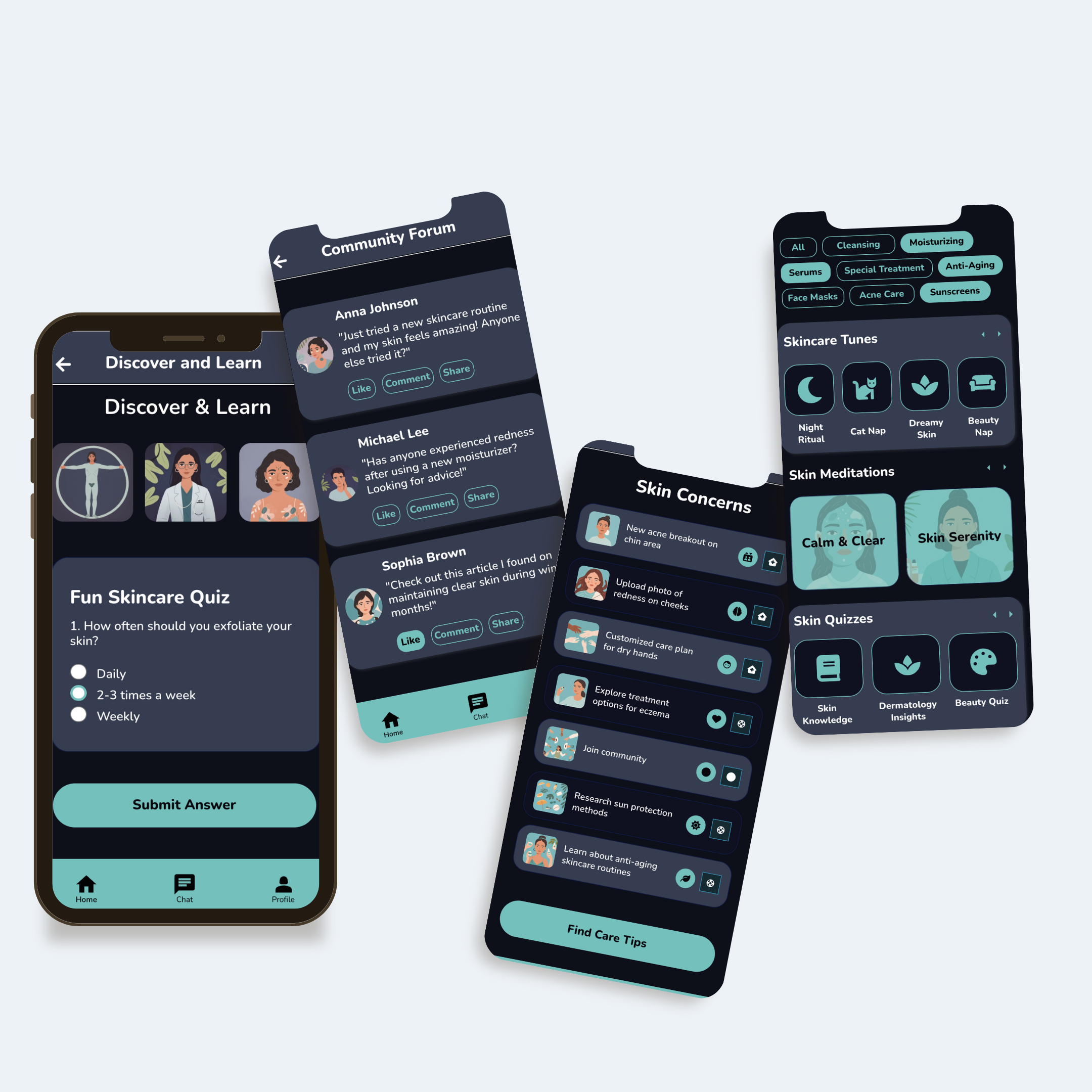
Support & Learning Community
Emotional Support Meets Skin Education.
In addition to medical features, users can access a rich library of guided meditations, skin care lessons, and peer support. This section makes Epiderma IQ more than just a tool—it becomes a safe space for users to grow, learn, and connect.
Reflection & Outcomes
This project helped refine how to:
- —Balance futuristic tech visuals with empathetic interface cues
- —Build trust in AI via friendly, spacious UI patterns
- —Push a mobile experience that supports emotional and physical health

Unexpected Challenges:
While working on the body map interface, it was difficult to strike a balance between simplicity and clarity—early versions were either too abstract or overly clinical. It also took several iterations to ensure the action cards on the home screen felt equally weighted without overwhelming the user.
What I Would Do Differently:
I would spend more time refining the visual hierarchy and simplifying certain screens to reduce cognitive load. I would also explore how to better guide users through the flow with more intuitive microinteractions or progress indicators. Since this project focused heavily on concept and visual design, I would next prioritize user input and real-world context to validate the experience beyond the screen.